In today's scenario, where technology is naturally intertwined with everyday life, ensuring that everyone, regardless of their abilities, can access and navigate digital platforms is not just a matter of inclusion but a fundamental aspect of user experience (UX) and user interface (UI) design.
Accessibility goes beyond simply complying with standards. It prioritizes inclusion and recognizes individuals' diverse needs and capabilities. In this article, we explore accessible design practices and how they benefit all users, improving clarity, efficiency, and overall satisfaction.
Analyzing Users Needs
Accessibility can be achieved through different modalities. Standards and legislation, such as WCAG (Web Content Accessibility Guidelines), allow designers to reach a wider audience. Despite demonstrating social responsibility, it is not only this audience that benefits from clear and consistent navigation, well-structured information, and intuitive interfaces.
Considering the different types of disabilities that can affect users, it is essential that digital products and services are designed to meet a variety of specific needs.
Subtitles and audio descriptions are essential resources for users with visual impairments, such as blindness or color blindness, and they help them understand the content presented on screen. Also, for those with mobility impairments, such as muscle control difficulties, offering alternative control options, such as virtual keyboards or voice commands, is key to ensuring accessibility.
In addition, adjustments such as contrast and font size are essential for users with limited vision. At the same time, simple and clear instructions are crucial to facilitate use by users with cognitive and learning disabilities. By considering and implementing these adaptations, designers can ensure that their products and services are accessible and usable by a wide range of users.
Practical ways to make your design more accessible
Don't just communicate through color
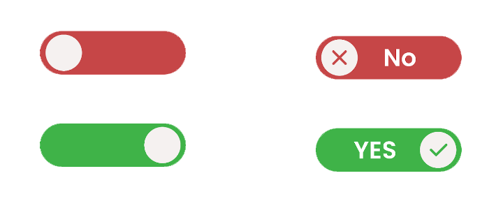
To ensure an inclusive and practical user experience, avoiding relying exclusively on color to communicate essential information is important. Instead, colors should enhance or complement visual elements already present in the interface.
In an e-commerce application, for example, instead of just using red to indicate that an item is unavailable, you could add an alert icon or an "Unavailable" tag next to the product. This ensures that critical information is clearly communicated, regardless of the user's visual capabilities, while offering a more consistent and intuitive user experience.

Font Size
It is essential to carefully consider the size and legibility of fonts. Although the Web Content Accessibility Guidelines (WCAG) do not have a minimum requirement for font size, it is still a valid consideration in terms of usability. Fonts should be no smaller than 12 px to ensure easy reading, especially for visually impaired users. However, the standard size for text is 16 px, which generally provides a more comfortable reading experience for most users.
In addition, the spacing between paragraphs and between letters and words should be adjusted to make the text more intuitive and easier to read. Examples of accessible fonts include Arial, Open Sans, and Roboto, which are widely recognized for their clarity and legibility in different sizes.
Color contrast
It is essential for users with low vision to adjust the colors, contrast with the background, and font size to ensure that the content is easily readable.
According to the Web Content Accessibility Guidelines (WCAG), the contrast between text and background should meet a minimum of 4:5:1 to ensure universal readability. For large-scale text, it can be at least 3:1.
In addition to individuals with disabilities, attention to contrast and font size benefits all users. In critical situations, such as alerts and important messages, text must be highlighted clearly and visibly. Prioritizing usability and accessibility improves the user experience as a whole and promotes a more effective visual brand identity.

Create accessible forms
To ensure accessibility in forms, it is essential to prioritize clarity and simplicity. Clear and concise labels and instructions are crucial elements of user-friendly forms.
Users can navigate the form smoothly by providing direct guidance and ensuring that error messages are displayed consistently.
Each input field should have an associated label, and placeholders should not be used as substitutes for labels. Instead, placeholders can serve as examples. In addition, users should receive feedback to understand the result of their input.
For longer forms, consider breaking them down into smaller, more manageable sections. This will improve the user experience and reduce the possibility of overload. By adhering to these principles, designers can create forms that cater to a wide range of users, promoting accessibility and usability.
Alternative texts, subtitles and translations
Integrating alternative text for images and subtitles for videos is essential to ensure user interfaces are accessible to all users. This additional text is read by people using screen readers, providing a helpful description for those with difficulty perceiving visual content.
In addition, the availability of transcripts and subtitles benefits a wide range of users. They are handy for those who don't understand the language of the content, for people with hearing impairments, and even for those who can't turn on the sound at the moment. Notably, the more languages available, the more accessible the content will be, ensuring that more people can enjoy it regardless of their needs.
Conclusion
In conclusion, accessibility plays a fundamental role in designing user interfaces, ensuring that all people can interact effectively with digital products, regardless of their abilities or limitations. By implementing accessibility practices, designers can create more accessible and inclusive user experiences.
It is important to recognize that accessibility is an additional consideration and an essential design component that benefits the entire user community. By prioritizing accessibility in UX/UI design, we can build a more inclusive digital environment where everyone can fully participate and enjoy their online experiences.
Tags
Subscribe to
Our
Newsletter
Join 1,000+ people and recieve our weekly insights.

Success!
Thank your for subscribing to Buzzvel's
Newsletter, you will now
receive
amazing
tips
and insights weekly.


