CSS Grid Demystified: How to Build Powerful Layouts with Ease

Share
CSS Grid Layout (aka “Grid” or “CSS Grid”) is a powerful two-dimensional (2D) layout system introduced in CSS3, designed to make it easy to create complex, responsive layouts in a simple and efficient way. Unlike Flexbox, which is also a great layout to use, it ends up being one-dimensional (it works with rows OR columns), while Grid allows you to manipulate rows and columns simultaneously.
In this article, we'll explore how CSS Grid works, its fundamental concepts, essential properties, practical tips, and examples to help you master this technique.
Basic Structure of CSS Grid
The basic structure of the Grid starts with a container and its child items . The container defines the context of the grid, while items are positioned within that structure.
<div class="container">
 <div class="item">1</div>
 <div class="item">2</div>
 <div class="item">3</div>
 <div class="item">4</div>
 <div class="item">5</div>
 <div class="item">6</div>
</div>
.container {
display: grid; /* Activates the grid layout */
grid-template-columns: 1fr 1fr 1fr; /*Define three column of equal size*/
gap: 10px; /* Spacing between items */
}
.item {
background-color: #4caf50;
padding: 20px;
color: white;
text-align: center;
}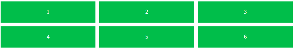
Explanation
display: grid: Sets the element as a grid container.
grid-template-columns: Creates three equal-sized columns using fractions (1fr).
gap: Adds spacing between columns and rows.
Main CSS Grid Properties
1. grid-template-columns and grid-template-rows
Sets the number and size of grid columns and rows.
.container {
  display: grid;
  grid-template-columns: 100px 1fr 2fr;
  grid-template-rows: 50px auto;
}
100px: First column with fixed width.
1fr: Second column occupies a fraction of the remaining space.
2fr: Third column occupies two fractions.
auto: The line automatically adjusts to the content.
2. gap, row-gap and column-gap
gap is a shorthand way of declaring the values of row-gap (which defines the space between rows) and column-gap (which defines the space between columns). To declare different values we can add a second size value (gap: 20px 10px) or write row-gap: 20px and column-gap: 10px separately.
.container {
gap: 20px; /* Spacing between rows and columns */
row-gap: 10px; /* Spacing between rows */
column-gap: 20px; /* Spacing between columns */
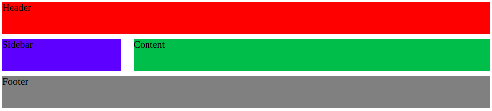
}3. grid-template-areas
Allows you to name specific areas of the grid, making it easier to lay out more complex designs.
.container {
 display: grid;
 grid-template-areas:
  "header header"
  "sidebar content"
  "footer footer";
 grid-template-columns: 1fr 3fr;
 grid-template-rows: auto 1fr auto;
}

.header { grid-area: header; }
.sidebar { grid-area: sidebar; }
.content { grid-area: content; }
.footer { grid-area: footer; }
Result:
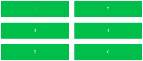
4. grid-auto-flow
Determines how items are positioned on the grid when they are not explicitly placed.
.container {
  display: grid;
  grid-template-columns: 100px 100px;
  grid-auto-flow: row; /* Automatically positions items in rows */
 }
5. And last but not least: grid-template-column: repeat and minmax( )
The grid-template-columns: repeat(auto-fit, minmax(200px, 1fr)) declaration is one of the most powerful and flexible CSS Grid declarations for creating responsive layouts. Let's break it down to understand each part and how it works:
grid-template-columns: As you learned earlier, this property is used to define the number of columns in a grid, as well as their widths. You can define columns with fixed, proportional, or dynamic values .
repeat( ): The repeat function allows you to create multiple columns automatically, reducing manual repetition.
grid-template-columns: repeat(N, value);
N: Number of repetitions
Value: width of each column
grid-template-columns: repeat(3, 200px);
This code creates three columns of 200px each. However, this is still not responsive.
auto-fit and auto-fill: To create truly responsive layouts, we can use auto-fit or auto-fill inside the repeat( ) function.
Difference between auto-fit and auto-fill:
auto-fit: Adjusts the number of columns based on available space. If there is extra space, it collapses the columns, expanding them to fill the remaining space.
auto-fill: Also adjusts the number of columns based on available space, but continues creating columns even if there is empty space, without collapsing.
.container {
 /* Collapses to take up all the space */
 grid-template-columns: repeat(auto-fit, 200px);

 /* Keeps columns event if there is empty space */
 grid-template-columns: repeat(auto-fill, 200px);
}
minmax( ): Minimum and maximum sizes.
The minmax(min, max) function allows you to define a size range for each column.
Example: grid-template-columns: minmax(minimumValue, maximumValue);
minimumValue: Minimum width that the column can have.
maxValue: Maximum width the column can have.
Example:
.container {
  grid-template-columns: minmax(200px, 1fr);
}
The column will be at least 200px wide .
If there is extra space, the column width can increase proportionally up to a limit of 1fr (1 fraction of the available space).
Explaining repeat(auto-fit, minmax(200px, 1fr))
Now that we understand the parts, let's go back to the example:
.container {
  grid-template-columns: repeat(auto-fit, minmax(200px, 1fr));
 }
How it works:
repeat(auto-fit, ...): Creates as many columns as will fit in the available space, automatically adjusting the number of columns.
minmax(200px, 1fr): Defines that each column must have at least 200px and, if there is extra space, it must grow proportionally until it occupies 1 fraction of the remaining space.
Flow:
On a wide screen, the grid creates several columns of at least 200px, distributing the rest of the space proportionally.
On smaller screens, the number of columns is automatically reduced so that each one maintains a minimum size of 200px.
If the screen space is too small, the layout adapts and columns may collapse to fit better.
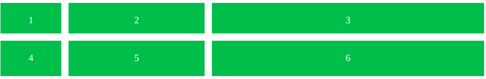
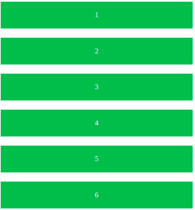
Practical Example: Responsive Image Gallery
First, let's define a grid-container with 6 children and then we'll style it.
<div class="grid-container">
 <div class="item">1</div>
 <div class="item">2</div>
 <div class="item">3</div>
 <div class="item">4</div>
 <div class="item">5</div>
 <div class="item">6</div>
</div>
.grid-container {
display: grid;
grid-template-columns: repeat(auto-fit, minmax(200px, 1fr));
gap: 20px;
}
.item {
background-color: #4caf50;
padding 20px;
color: white;
text-align: center;
}Behavior
On large screens (above 1200px): Multiple columns will be displayed side by side, taking up all available space.

On medium screens (between 600px and 1200px): The number of columns will be reduced to fit the available space.
On small screens (below 600px): Columns may collapse to a single vertical column.
Conclusion
CSS Grid has transformed the way we develop web layouts, bringing a two-dimensional approach that makes it easier to create modern, flexible and responsive interfaces, allowing us to align and distribute elements efficiently, both in rows and columns, reducing the complexity of designs that previously required hacks or unintuitive solutions.
In this context, one of the most powerful techniques is the use of grid-template-columns: repeat(auto-fit, minmax(200px, 1fr)). This approach offers an elegant solution for building dynamic layouts that automatically adjust to the screen size. The result is a responsive layout that takes advantage of all available space without requiring manual adjustments or additional media queries. With this configuration, your projects gain in efficiency, adaptability, and consistency, providing the user with a fluid experience on any device.
By mastering CSS Grid and techniques like it, you'll be prepared to take on more complex layout challenges, creating interfaces that not only work well, but also raise the bar on quality and usability for your projects.

.jpg)
.jpg)
Related Posts

Insights
CSS Architecture That Scales: Understanding BEM, ITCSS, and CSS Modules
The way you organize your CSS determines whether your codebase becomes a maintainable foundation or a tangled mess that slows down every feature release. CSS architecture isn't about making your code prettier, it's about building systems that scale with your team and product.


Insights
The Death of User Flows: Designing for Conversations Instead of Screens
For decades, user flows have been one of the most fundamental tools in UX design. We map journeys, identify decision points, remove friction, and optimize paths toward a desired outcome.
Subscribe to
Our Newsletter
Join 1,000+ people and receive our weekly insights, tips, and best practices.

Success!
Thank you for subscribing to Buzzvel's
Newsletter, you will now
receive amazing
tips and insights weekly.