The Human Touch Returns: Design Trends for 2026
-normal.webp)
Share
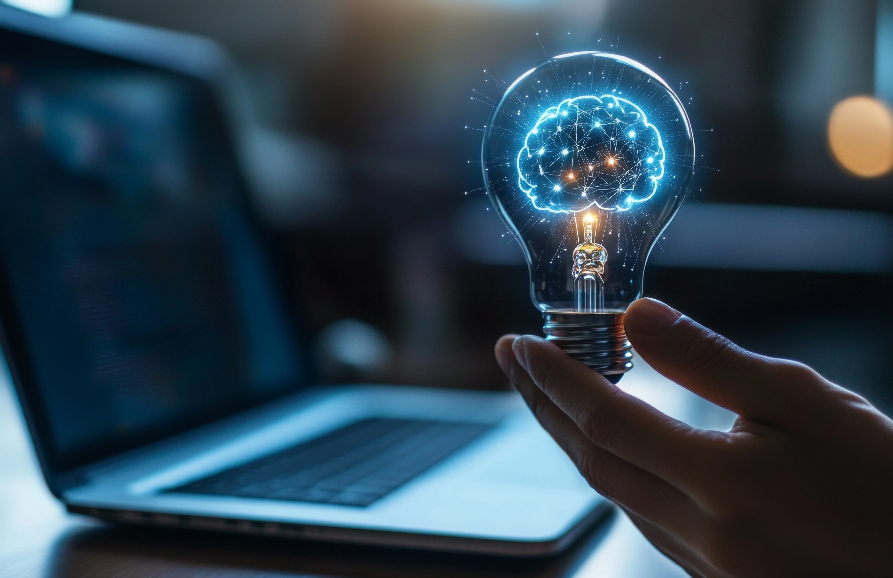
In an era where artificial intelligence can generate flawless graphics with a simple text prompt, a compelling counter-movement is emerging. The dominant visual design trends for 2026 aren't about sterile perfection or algorithmic uniformity. Instead, they are a vibrant, tactile, and deeply human response.
This year, we witness a collective yearning for authenticity, sensory connection, and expressive imperfection. The future of design lies not in the machine alone, but in the creative partnership between human intuition and digital tool, resulting in work that feels thoughtfully crafted and emotionally resonant.
The Core Drivers: Why "Human" is the New Premium
Two powerful forces are shaping this shift. First, digital fatigue has set in. Users are overwhelmed by sleek, homogenous interfaces and cookie-cutter visuals. There's a growing craving for designs that feel organic, unique, and possess a distinct "soul." Second, the rise of generative AI as a creative partner has liberated designers from the minutiae of execution, allowing them to focus on concept, curation, and emotional impact. The new premium is on the human decision – the imperfect brushstroke, the curated collage, the playful interaction-that a machine cannot replicate on its own. This sets the stage for the specific trends defining the visual landscape of 2026.
1. Tactile Textures & "Squishy" UI: Designing for the Senses
The flat design era is giving way to a rich, textured one. We're moving beyond visual aesthetics to create interfaces and graphics that imply a haptic experience, inviting users to "feel" with their eyes.
What it is: This trend uses soft shadows, blurred layers, and material simulations to make digital elements appear tangible. Think of glass morphism (frosted, translucent effects), interfaces that mimic the softness of silicone, wax, or gel, and buttons that visually deform or "squish" when clicked. In graphic design, this translates to backgrounds and artwork that emulate handmade paper, coarse canvas, embroidered fabric, or brushed metal.
The Why: In a flat-screen world, texture creates depth, comfort, and a subconscious feeling of quality and care. It breaks the digital coldness and builds a more intuitive, engaging relationship.
Application: A banking app might use soft, frosted glass panels over a subtle linen texture to feel secure and premium. A wellness brand's website could employ squishy, gel-like toggle switches and buttons. A music poster might feature text that looks like melted vinyl or felt.
2. Intentional Imperfection & "Naive" Design
Polished, vector-perfect illustrations are making room for the charmingly irregular. The "Naive Design" trend embraces a hand-drawn, unrefined, and candid aesthetic that prioritizes authenticity over technical precision.
What it is: This includes illustrations with wobbly lines, uneven coloring, and simple, almost childlike forms. It celebrates the "happy accident"-visible brush strokes, pencil sketches under digital paint, and collages made from ripped paper. The "Candid Camera Roll" sub-trend uses photography that feels spontaneous, grainy, and unstaged, starkly contrasting hyper-produced stock imagery.
The Why: Imperfection builds trust and approachability. It signals that a human is behind the work, fostering a more genuine connection with the audience. It’s a visual antidote to the often impersonal feel of AI-generated content.
Application: A tech startup's website might use scribbled diagram illustrations to explain complex services simply. A food delivery app could feature photos of actual meals from local chefs, complete with natural shadows and composition, rather than clinical studio shots. A brand's social media might adopt a consistent, hand-drawn icon set.
3. Expressive Typography & Energetic Collage
Typography is shouting, whispering, and dancing off the page and screen. The trend is maximalist, personality-driven, and treats type as the primary visual hero.
What it is: Designers are mixing typefaces, weights, and sizes with fearless confidence in "Type Collages." Custom, exaggerated letterforms, kinetic type in motion graphics, and text treated as texture or image are everywhere. This pairs seamlessly with the "Trinket Design" trend, which involves energetic collages of small objects, icons, and charms that tell a visual story around the type.
The Why: In a short-attention-span world, expressive typography grabs focus instantly and communicates tone before a single word is read. It is a direct channel for brand personality-be it playful, rebellious, or sophisticated.
Application: A festival poster might use five different clashing fonts arranged in an explosive layout. A website's hero section could feature a massive, custom-display font that animates on scroll. A brand guideline might include a "trinket collage" of related items as a recurring graphic motif for campaigns.
4. Vibrant Color & Dynamic Gradients
Muted palettes are being pushed aside by bold, optimistic, and highly saturated color. This is a direct reaction to years of neutral minimalism and a desire to evoke emotion and energy.
What it is: Expect to see neon brights, stark high-contrast combinations, and complex, fluid gradients that shift like liquid or light. "Cyber" colors (electric blues, hot pinks, acid greens) and gradients that simulate iridescent or holographic surfaces are particularly strong. These aren't just accents; they are often the dominant background or core visual element.
The Why: Color is a powerful emotional and psychological tool. Vibrant palettes stimulate, delight, and enhance memorability. Dynamic gradients create a sense of depth, movement, and modern digital craft.
Application: A fitness app might use a gradient that shifts from sunrise orange to vibrant purple to motivate energy. A SaaS dashboard could use a bold, single-color dark mode with neon highlights for data points. A series of social media graphics might use a consistent duotone gradient overlay to create cohesion.
5. Dynamic Layouts & "Controlled Chaos"
The rigid, predictable grid is being challenged by layouts that feel editorial, dynamic, and asymmetrically balanced. This trend borrows from the energy of print zines and the fragmentation of digital spaces.
What it is: This includes overlapping text and images, broken grid layouts, and elements that appear to be taped, pinned, or layered. The "Bento Grid"-a popular UI pattern-offers a modern take by organizing information into neat, modular containers, but often within a larger, asymmetrical framework. It's a "controlled chaos" that feels both curated and spontaneous.
The Why: These layouts create visual interest, guide the eye on a journey, and make content feel fresh and unexpected. They signal a break from corporate templating and suggest a more artistic, curated approach.
Application: A news or magazine website might use overlapping image blocks and staggered text modules for its feature stories. A portfolio site could employ a Bento grid to showcase projects in a clean yet visually dense format. An album cover might use a chaotic collage layout to represent the music's energy.
6. Nostalgia-Futurism Fusion
Rather than looking purely forward or backward, designers are blending nostalgic aesthetics with futuristic elements to create a unique, timeless, and often surreal vibe.
What it is: This is the visual melting pot. You might see the glossy, bubbly icons of Y2K design reimagined with neon glitch effects. Medieval manuscript illustrations rendered in 3D software. The muted, dystopian tones of "Liminal Space" photography combined with sleek UI elements. It's a remix culture applied to visual eras.
The Why: This fusion creates instant familiarity while feeling novel. It taps into comforting nostalgia while satisfying the desire for innovation, resulting in deeply intriguing and conversation-starting visuals.
Application: A VR platform's interface might use retro-futuristic CRT monitor glitches as a design element. A fashion brand's campaign could feature models in digital landscapes that blend Renaissance painting backgrounds with cyberpunk cityscapes.
How to Integrate These Trends into Your Work in 2026
Adopting these trends isn't about using all at once. It's about strategic application:
Start with "Why": Always match the trend to your brand's core message. Tactile texture suits a brand focused on comfort; naive illustration fits one valuing transparency.
Partner with AI, then Humanize: Use AI tools for rapid ideation, asset generation, or exploring variations. Then, import the outputs into your design software and add the human layer-adjust the kerning by hand, add a textured overlay, or integrate a hand-drawn sketch.
Focus on Emotion: Ask what feeling you want to evoke. Energy? Use vibrant color and chaotic type. Trust? Use tactile textures and imperfect illustrations.
Prioritize Balance: If using a chaotic layout, ensure navigation remains intuitive. If colors are vibrant, provide ample negative space to rest the eye.
Conclusion: The Era of Human-Centric Digital Craft
The visual design trends of 2026 mark a significant and welcome pivot. They represent a maturity in our relationship with technology. The goal is no longer to make the digital world look perfectly digital, but to infuse it with the warmth, texture, and delightful imperfection of the physical human experience. For designers, this is an exciting call to arms: to act as curators, editors, and emotive creators who use all tools-from the pencil to the AI generator-not to create something flawless, but to create something meaningfully and unmistakably human.
.jpg)
.jpg)
Related Posts

Insights
The Death of User Flows: Designing for Conversations Instead of Screens
For decades, user flows have been one of the most fundamental tools in UX design. We map journeys, identify decision points, remove friction, and optimize paths toward a desired outcome.


Insights
Beyond Engagement: How We Can Design for Focus and Human Well-being
The relentless pursuit of digital engagement has left many feeling drained and distracted. As designers, we've often crafted experiences optimizing for metrics that, while beneficial for business, have inadvertently contributed to digital fatigue.
Subscribe to
Our Newsletter
Join 1,000+ people and receive our weekly insights, tips, and best practices.

Success!
Thank you for subscribing to Buzzvel's
Newsletter, you will now
receive amazing
tips and insights weekly.