The Psychology of Colors in UI/UX

Share
There are websites with such friendly colors that captivate users, just as there are confusing apps that make you want to flee. Well, the choice of colors is responsible for these experiences. They work like magic in interface design (UI), influencing how we feel and interact.
Introduction
Understanding the psychology of colors is a valuable trick for designers, especially those in user experience (UX). This adds a special touch to their skills and improves their chances in the market.
Color theory will be our guide in this article to better understand colors. It provides essential tips, such as choosing the right color for highlights, using primary, secondary, and tertiary colors in design, and creating palettes that make everything harmonious. Let's delve into the psychology of colors in UI/UX!
What is color theory?
Before understanding how colors influence the user experience, we need to grasp what color theory is.
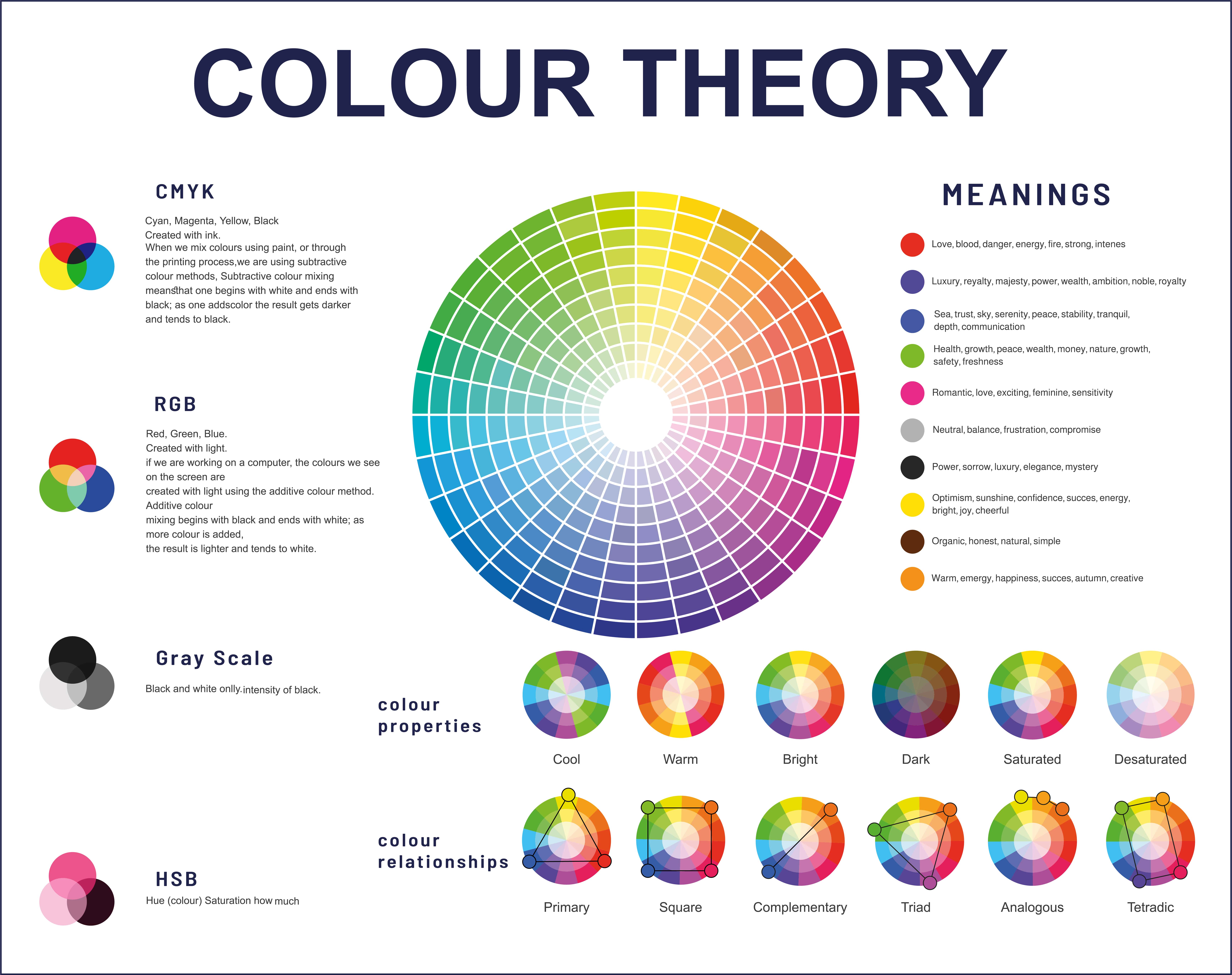
Color theory is a field that explores how colors work together and how we perceive them. It's like a giant puzzle of colors. There are different models, such as RGB, used in screens, which combines red, green, and blue, or CMYK, used in printing, which uses cyan, magenta, yellow, and black. Additionally, color theory also delves into how colors can affect our emotions.
This theory is crucial for UI/UX designers as it can use colors appropriately to enhance visual design and aesthetics. Let's explore some colors and the emotions they evoke:
Red: often associated with energy. Capable of eliciting intense emotions, ranging from love and excitement to urgency and intensity. It is frequently used to create elements that demand attention and calls to action.
Blue: represents calmness and trust; blue is commonly used in applications where reliability and professionalism are crucial. Known for conveying tranquility and instilling a sense of security in users.
Green: symbolizing nature and growth, green is often used in applications related to ecology and health, promoting a sense of freshness and relaxation.
Yellow: vibrant and cheerful; yellow is often associated with happiness and optimism. It can highlight essential elements or create a positive and welcoming atmosphere.
Orange: combining the energy of red and the playfulness of yellow, orange is used to create a sense of enthusiasm and vitality.
Purple: radiating luxury and creativity, purple is often used in designs that evoke a sense of sophistication and uniqueness.
Fundamental Elements of Color Theory
The theory of colors encompasses three essential elements: hue, saturation, and brightness, which play crucial roles in the visual appearance of any object or design, influencing how people perceive colors.
Hue: Thinking straightforwardly, hue is simply the color we see. This is the visual part, the 'vibe' of the color. Hue relies on three primary colors (red, yellow, and blue) and their secondary siblings (orange, green, and violet). In summary, all colors we perceive have a bit of these six colors, giving rise to the hue.
Saturation: Saturation, as the name suggests, is the intensity or strength of a color. The purity of the color determines whether it is more or less saturated. For example, when designers want to attract attention, they often opt for more saturated colors to catch the eyes.
Brightness: Brightness, sometimes called luminosity, refers to the luminous intensity of a color. The amount of light emitted by an object influences the perception of color. In a color palette, it's easy to notice super bright and vibrant colors and darker ones. Designers must balance this mix to create a captivating and visually pleasing palette.
How do you apply the Psychology of Colors in UI/UX?
Now that we understand how colors impact the user experience let's explore how this knowledge can be used to create more engaging designs:
Accessibility: Inclusive design is more than essential to open doors for everyone. Imagine those with visual difficulties or color blindness – we want everyone to have a fantastic experience. Therefore, we play with striking contrasts, include alternative texts, and adopt accessible design practices. It's not just about reaching more people; it's about creating a space where everyone is welcome, embracing ethical principles that make the design shine uniquely.
Building Brand Essence: A unique color palette brings life and personality to the brand. If you're creating a health app, how about diving into soft shades of green and blue to convey tranquility? For a food delivery service, vibrant reds and yellows can awaken appetite and an extra dose of excitement. When users encounter the characteristic color palette of the brand, it promotes a sense of familiarity and trust.
Elevating User Journey: Colors act as guides in the interface. We are emphasizing and leading users by choosing standout colors, especially in CTAs (Call to Action). It's like turning on a light in the right direction, inviting them to enter. The user experience is not just about clicks; it's about a journey that is also engaging.
Highlighting Information Organization: By using different colors for primary, secondary, and tertiary elements, we are creating a visual map. The result is a user experience that is intuitive and guides the gaze.
The 60-30-10 Rule in UI/UX Design
I like to use the 60-30-10 rule in UI/UX Design. What is this rule?
The 60-30-10 rule in UI/UX Design is an approach that uses percentages to define the presence of colors on a page. Although these values are abstract, they represent the relative magnitude of each color's presence. This percentage distribution has the following interpretation:
60% for the Dominant Color: This is the primary color that predominates in interfaces, giving significant presence and defining the predominant visual tone.
30% for the Secondary Color: Acting as a contrast to the dominant color, the secondary color is crucial in creating visual harmony, providing variety and balance.
10% for the Accent Color: The accent color, often related to the brand's identity, is reserved for elements that require emphasis, such as buttons, links, and icons, providing highlight and visual cohesion.
While it may be challenging to quantify these percentages precisely in practice, the 60-30-10 rule provides a valuable conceptual framework for guiding the choice and distribution of colors in design interfaces.
In summary, the 60-30-10 rule offers a structured and intuitive approach to color design in UI/UX. By considering dominance, contrast, and emphasis, this rule provides an aesthetic balance that enhances the user experience. Although the percentages are more conceptual guidelines than strict rules, applying these principles creates visually appealing and functionally effective interfaces.
Conclusion
In conclusion, incorporating the psychology of colors in UI/UX design is essential for creating engaging and impactful digital experiences. Colors have the unique power to evoke emotions, influence decisions, and shape user perception. By understanding color theory and its psychological effects, designers can transform simple interactions into memorable experiences. Carefully choosing color palettes, applying color theory to highlight essential elements, and considering cultural preferences are fundamental elements for UI/UX design success. Color harmonization visually attracts and intuitively guides users, promoting an engaging journey.
Tags
Design
.jpg)
.jpg)
Related Posts

Insights
The Death of User Flows: Designing for Conversations Instead of Screens
For decades, user flows have been one of the most fundamental tools in UX design. We map journeys, identify decision points, remove friction, and optimize paths toward a desired outcome.


Insights
Beyond Engagement: How We Can Design for Focus and Human Well-being
The relentless pursuit of digital engagement has left many feeling drained and distracted. As designers, we've often crafted experiences optimizing for metrics that, while beneficial for business, have inadvertently contributed to digital fatigue.
Subscribe to
Our Newsletter
Join 1,000+ people and receive our weekly insights, tips, and best practices.

Success!
Thank you for subscribing to Buzzvel's
Newsletter, you will now
receive amazing
tips and insights weekly.